

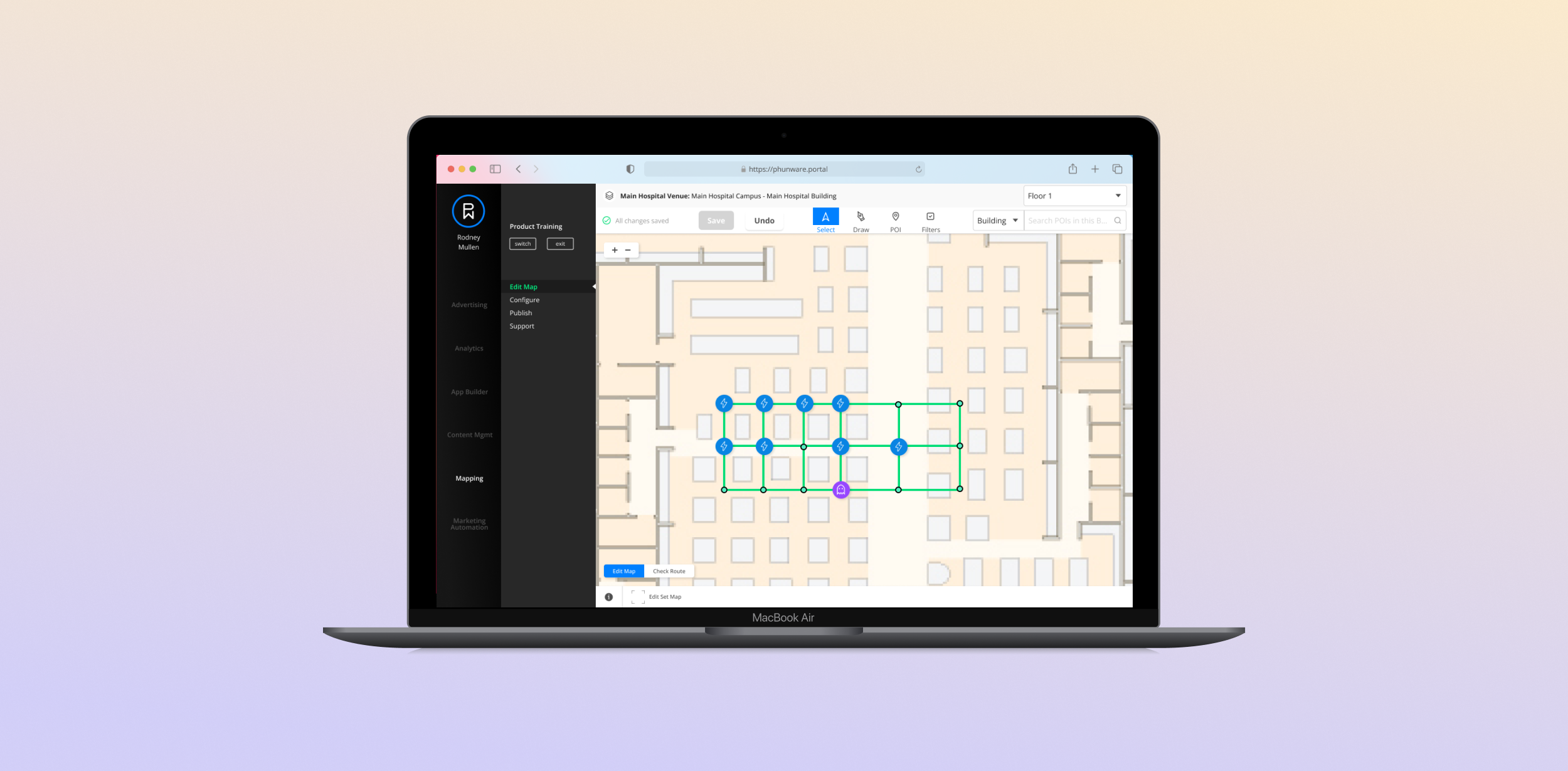
Map Editor
Role
Product Designer
Team
VP of Product
Product Designer
UX/UI Designer
Front/Backend Developer
Tools
Figma
Duration
2 weeks
Background
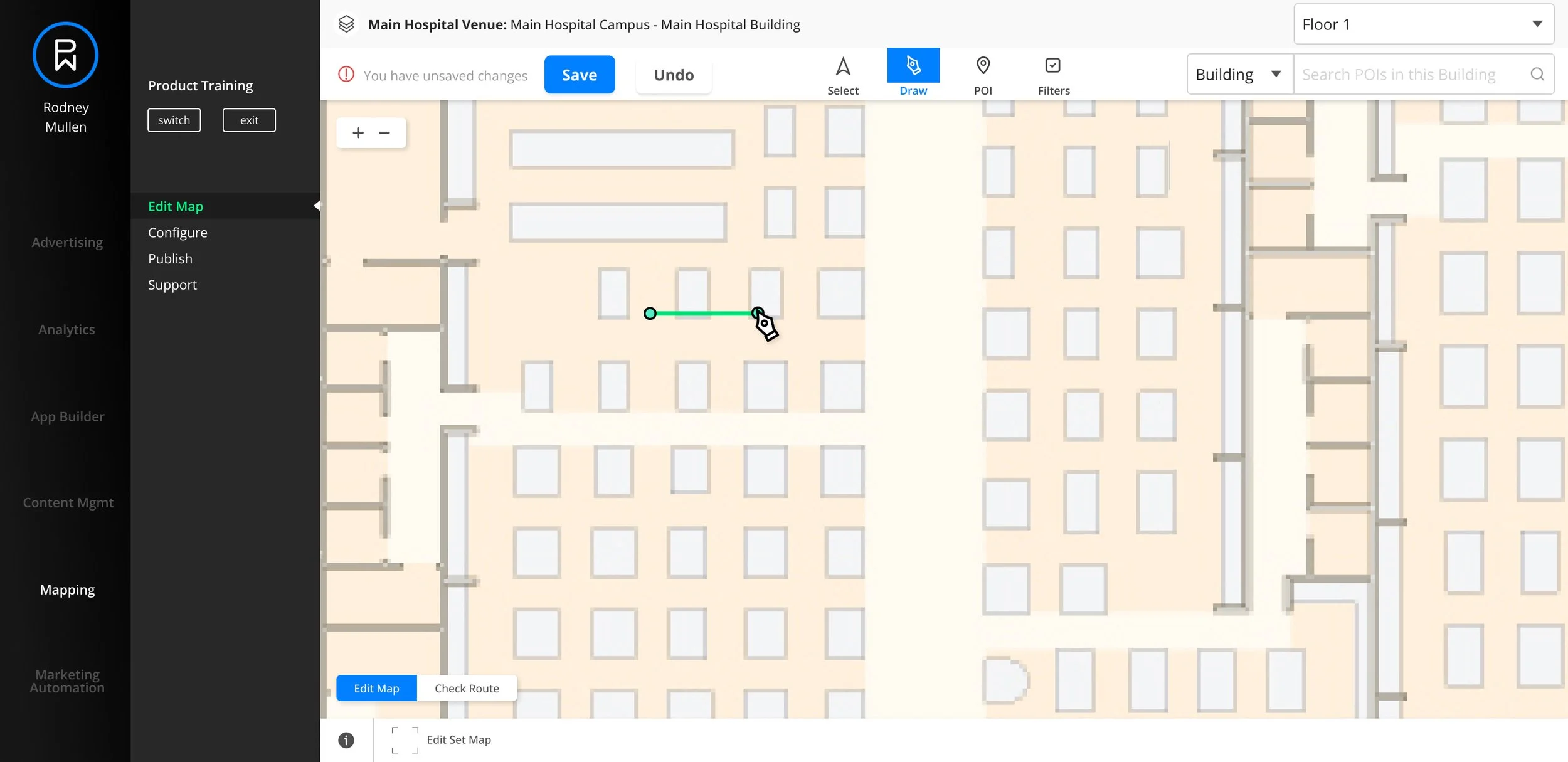
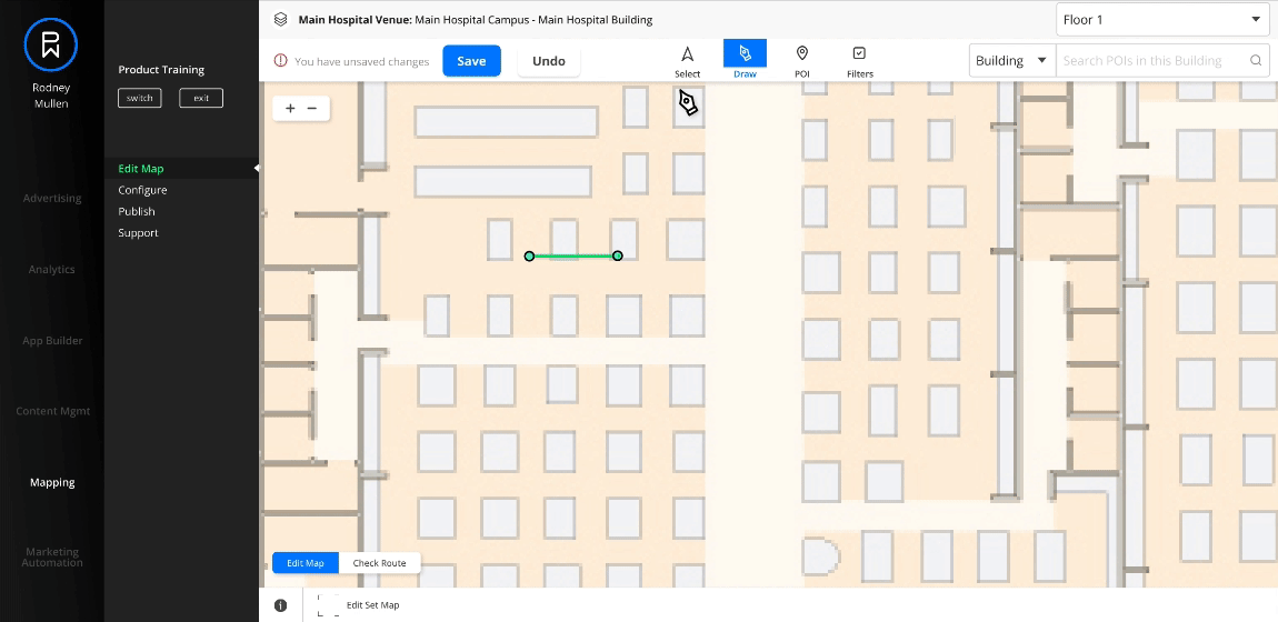
The Map Editor allows Phunware clients to incorporate indoor navigation within consumer-facing apps. Users set up the map by creating waypoints, which connect together to form routes, and add Points of Interest (POI) to manage the app’s wayfinding experience.
Goal
Phunware wanted to redesign the Map Editor to be more user-friendly. The UI was already redesigned by another designer by the time I was added to the project. I was assigned to work on a way for users to save their work without them feeling like it would block them from their flow and slow them down.
Original Design

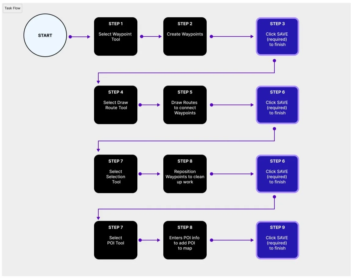
Original Task Flow
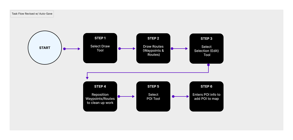
Redesign Progress
Previously, waypoints had to be created first before users could connect them together with the connect tool. In the redesign, they are combined into a single Draw Tool where each successive waypoint added to the map is automatically connected.

Initial Redesigned UI from Other Designer

Reduced Steps (if Auto-Save was possible)
With some of the tools combined, the steps in the workflow reduced drastically, especially in the scenario where auto-save could be used. Auto-Save was initially proposed, but we later found out it couldn’t be supported without more work done to the backend.
Since we couldn’t support auto-save,
how should users save without getting annoyed?
Design Explorations
Master Save
I initially explored the idea of a Master Save button, where the user could decide when to hit save rather than being required to. This would also be something that could be easily removed once we finally support auto-save, which was the ideal solution in the future.

Risk of Loss
While getting feedback for the initial idea, my team expressed that people might outright forget to save if they had to be the one to decide when to save for everything. So when should users be required to save as opposed to when can it be a decision users make for themselves?
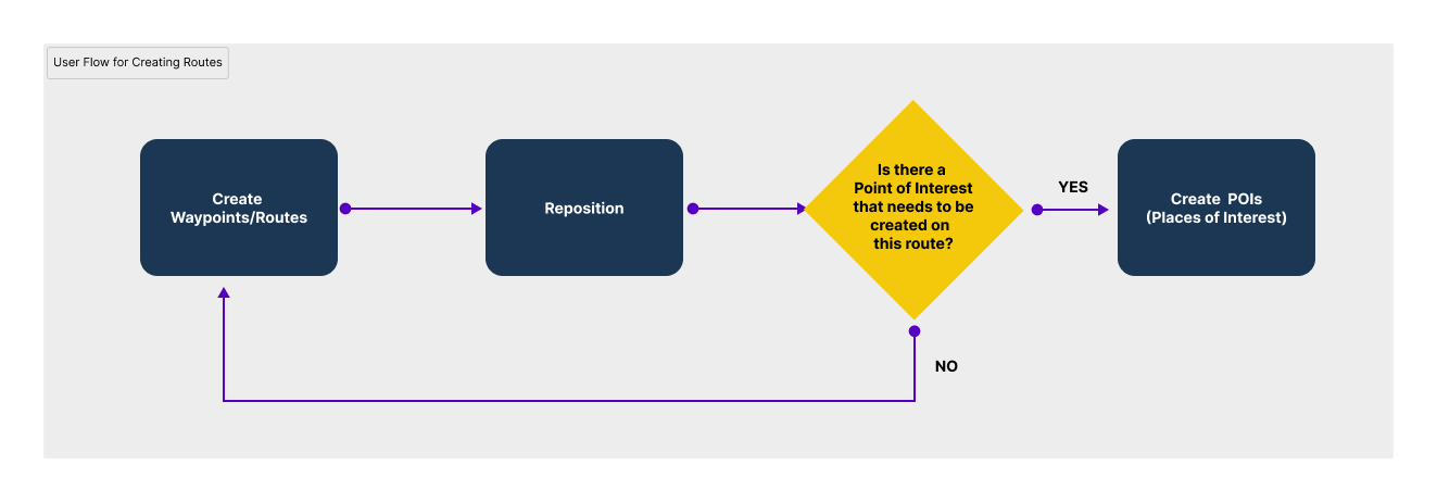
Understanding the Users’ Process
I revisited the feedback that users had provided about their annoyance. They had indicated that they often switched between creating and repositioning the waypoints, which meant that they had to hit save every time they switched. In other words, users repositioned their waypoints/routes as they went along creating them. The workflow for creating routes wasn’t linear.
A Draw Tool with Selection Option?
I suggested a Figma-inspired solution where selecting the Draw Tool would display a different toolbar where users could toggle between it and the Selection tool with a Done button to save and exit. Due to both time and technical constraints, however, this suggestion was vetoed.

When Should Save be Required?
Unlike waypoints and routes, Points of Interests require users to fill out additional details that would be irritating to redo if the information wasn’t saved properly. I proposed that users can be given the option to save with the Master Save button when creating waypoints and routes, but when creating a POI, saving should be required.
Before
Master Save Button Only

The Master Save in the original iteration applied to everything, but it made everything optional to save.
After
Master Save Button + POI Specific Save Button

When editing/adding POI, the Master Saveis inactive and a separate save button is shown for the POI that’s required before exiting the view.
Save Everything or Nothing
As it turned out, if I gave the Point of Interest panel a Save button, it would ALSO save the edits done before the POI was added due to the way the backend worked. It was visually misleading, but we decided that it wasn’t problematic. After all, the preferred solution was to originally introduce auto-save, which we weren’t able to do.
New Redesign for Saving
1) The user selects the Draw tool and create waypoints, automatically creating routes. The option to Save is available.
2) The user can click on Select tool and drag a waypoint to adjust route.
3) After routes have been created, the user creates the POIs and fills out the information. When they hit save from the POI panel, everything is saved.

NOTE: If users click on the links in the site’s navigation without saving, an alert to save will show before the user is allowed to leave the map view. This occurs regardless of whether the POI panel is opened or not.

Responsive Views
This task can only be done on a desktop given the nature of the work. Since staff would likely need to copy information from excel sheets over to the POI panel’s form fields, two windows would likely be placed side by side if users worked with a single monitor when filling out information.

Narrower
If the browser width is made significantly smaller and the POI panel is opened, the panel’s width will be maintained because users will still likely be inputting information into the form fields.

Most Narrow
The panel’s width is maintained until it can no longer be shown. At this point, the navigation would take visual priority so that users have context as to which view they’re at.
Conclusion
Our backend’s inability to support auto-save was challenging. It would be important to see if users have issues with having to decide when they should save. Ideally, the next step would be to observe the staff’s interaction with the new UI and iterate further.